Learning with Lighthouse 💡✨
Portfolio Review Part II
Last week I gave an overview of some tools and tutorials I used to complete my most recent portfolio website. I was pretty bummed after I ran my first Lighthouse report and realized my website was not performant based on Lighthouse metrics:
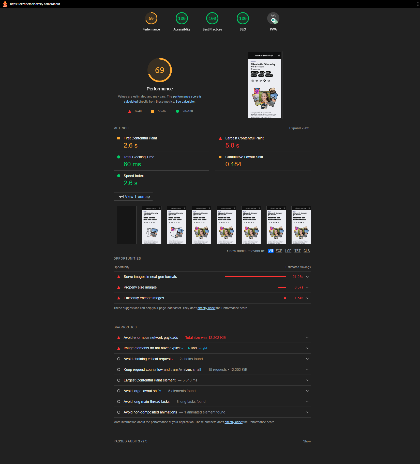
The silver lining to this poor report is that it provided specific opportunities for me to improve my website's performance. Metrics targeted in this overview include Largest Contentful Paint, First Contentful Paint, and Cumulative Layout Shift.
⭐ Largest Contentful Paint (LCP)
The diagnostics indicated that Largest Contentful Paint (LCP) was the area most in need of improvement. LCP is a metric used to assess the loading performance of a web page. It measures the time it takes for the largest visible element in the viewport to become fully rendered and displayed to the user.
LCP is also particularly important because it reflects the user's perception of the loading speed and the point at which they can start engaging with the content. A "good" LCP score under 2.5 seconds and anything after 4 seconds is considered "poor." My LCP score was currently 5 seconds, meaning it took 5 seconds to fully render the largest visible element on the page (which was an "About Me" image in this case).
Addressing how I handled images would be a great start to improving my website's LCP and overall performance.
Next-Gen Image Formats
Lighthouse provides the top ways to save seconds in the "opportunities" section. "Serve images in next-gen formats" had a potential estimated savings of 51.53 seconds and would be my first task.
Next-gen image formats are advanced file formats designed to offer superior compression, improved quality, and additional features compared to traditional image formats like JPEG and PNG. They provide faster loading times, better visual quality, and reduced bandwidth usage. JPEG 2000, JPEG XR, AVIF, and WebP are common next-gen image formats. When using these formats, it's important to consider compatibility with target platforms and provide fallback solutions for browsers that do not support the chosen format.
AVIF (AV1 Image File Format)
I decided to convert all images to AVIF (AV1 Image File Format). AVIF utilizes the powerful compression capabilities of AV1 to achieve high compression efficiency and excellent image quality. Its compression efficiency often leads to smaller file sizes compared to JPEG and other formats, making it suitable for web use. The format is currently supported in Chrome, Firefox, and Opera. I need to include a fallback for any visitors using alternative browsers.
I started by converting all images to the AVIF format using the online tool Squoosh (GitHub). The app is pretty intuitive to use but I still found the video "How To Optimize Images with the Squoosh.app" by Steven Monson helpful to implement the new format. One especially helpful tip (1:50) was to use the 'Network' tab in your Chrome Dev tools to see all images on the page and sort them by their size to see the most crucial files to optimize.
As mentioned previously, it is important to provide a fallback for anyone not using Chrome, Firefox, and Opera. I opted to leave the png images as fallbacks since I anticipate most of my viewers to use one of those browsers. I could have also opted to use WebP as an additional fallback (and most likely will in the future).
Take a look at this code example from my Project.js file:
<picture className='project-img-container'>
    <source srcSet={avif} type="image/avif" alt={title}/>
    <img className="project-img"
         src={img}
         alt={title}
         loading="lazy"/>
</picture>
The outermost element is a
<picture>element. This element is used to provide multiple sources for an image allowing the browser to choose the most appropriate source based on factors like format support, screen size, and resolution.Inside the
<picture>element is the<source>element. The<source>element is used to define alternative image sources and specify the format using thetypeattribute. In this case, it provides an AVIF image source using thesrcSetattribute, which contains the URL of the AVIF image.Following the
<source>element, there is an<img>element. This element serves as a fallback in case the browser doesn't support the AVIF format or if the AVIF image fails to load. Thesrcattribute contains the URL of the image in a more common format (e.g., JPEG or PNG).Both the
<source>and<img>elements havealtattributes that provide descriptive text for the image. This is important for accessibility, as screen readers and other assistive technologies use this text to convey the image's content to users who may have visual impairments.
⭐ First Contentful Paint (FCP)
First Contentful Paint (FCP) measures the time it takes for the first meaningful piece of content (text or image) becomes visible to the user. It marks the point when the user can start engaging with the content, even if the rest of the page is still loading. A "good" FCP occurs within 1.5 seconds and anything after 3 seconds is considered "poor". My FCP was 2.6 seconds to start (extremely close to the "poor" rating).
There was a problem with how both my images and my text were loading.
Images that were out of view were loading on the page load unnecessarily. I would need to optimize the loading of non-critical resources to prioritize the loading of critical resources.
Lighthouse warned me to "Avoid chaining critical requests", which in this case was my CSS stylesheet. The browser needs to fetch the CSS file first before it can identify and fetch the font to display text. There are a few things you can do like including any critical CSS inline and prioritizing "above-the-fold" content. Additionally, you can host fonts locally. Keep reading to see how I hosted a font locally for the first time.
Lazy Loading
Converting images to next-gen format was a great start, but you may have noticed something else I added in the code snippet above: loading="lazy".
Lazy loading is a browser-native attribute that instructs the browser to only load the image when it's about to come into the user's viewport, improving the initial page load performance by preventing unnecessary early loading.
I made sure to apply lazy loading to images that were not in view on load and not necessary for the first contentful paint.
There are other advanced ways to handle lazy loading, such as providing a skeleton or blurred image as a placeholder until the image is fully displayed (this can also help improve the Cumulative Layout Shift). I plan to try this out in the future after watching WedDevSimplified's video "How to Load Images Like A Pro".
Hosting Fonts Locally
I experimented first to see how much of an impact my font would have on the page load. I changed my font from a Google font (Montserrat) to a system font (Helvetica). Voila! My score rocketed to 'green'. I considered stopping here. Helvetica, also a sans-serif typeface, is a classic and clean font, however, I couldn't stop thinking about how limiting it would be to only use system fonts in the future. Hosting fonts yourself provides greater control over font loading and reduces reliance on external resources. I needed to learn how to host fonts locally eventually... so why not now?
I started by watching the video "Self-hosting fonts explained // @font-face tutorial" by Kevin Powell.
While I could not use the website he used in the video effectively (Font Squirrel Webfont Generator), I found an alternative Webfont generator (Transfonter) and was able to use the rest of the tutorial.
The necessary steps included:
downloading the fonts used from Google Fonts
(Ensure that you have the necessary rights to use the fonts on your website, whether they are custom fonts or third-party fonts. Google Fonts is a collection of free, open-source fonts that are designed for web use. They are provided by Google and are available for anyone to use in their projects, both personal and commercial, without any licensing fees.),
converting fonts from
.ttfto.woffand.woff2(using Transfonter),adding the new font files to the project folder (src>assets>fonts),
and setting up
@font-facerules to use the fonts in CSS.
The @font-face rule is an at-rule in CSS that defines a custom font to be used on a web page. It allows you to include multiple variations of the same font family, such as different weights (bold, light) or styles (italic). Each variation should have its own @font-face rule with appropriate properties. Once the @font-face rule is defined, you can use the custom font family in your CSS just like any other font family. See my example from App.css:
@font-face {
    font-family: 'Montserrat';
    font-weight: 400;
    src:    url('./assets/fonts/Montserrat-Regular.woff2') format('woff2'),
            url('./assets/fonts/Montserrat-Regular.woff') format('woff');
    font-display: swap;
}

@font-face {
    font-family: 'Montserrat';
    font-weight: 700;
    src:    url('./assets/fonts/Montserrat-Bold.woff2') format('woff2'),
            url('./assets/fonts/Montserrat-Bold.woff') format('woff');
    font-display: swap;
}

* {
    box-sizing: border-box;
    margin: 0;
    padding: 0;
    scroll-behavior: smooth;
    /* font fallback */
    font-family: 'Montserrat', sans-serif;
    transition: all 0.04s ease-in;
}
The font-display: swap; property is extremely important for page load because it ensures that text remains visible using system fonts until the custom fonts are loaded.
Another important consideration is to provide a fallback system font. I have done that here with font-family: 'Montserrat', sans-serif; This means that if the "Montserrat" font is still loading or fails to load, the browser will use a generic sans-serif font instead. Including a font fallback ensures that your content remains legible even if the custom fonts are currently unavailable.
⭐ Cumulative Layout Shift (CLS)
Cumulative Layout Shift (CLS) measures the visual stability of a web page as it loads and becomes interactive. It quantifies how much the page's content shifts or moves around unexpectedly during the loading process, causing a potentially disruptive user experience.
CLS is calculated by summing up the impact fraction of every unexpected layout shift that occurs during page load. The impact fraction is the product of the ratio of the changed area and the distance the element has shifted vertically.
CLS is usually reported as a value between 0 and 1, where lower values indicate better visual stability. (A CLS score of 0 means no layout shifts, while a score of 1 means significant and constant shifting.) A good CLS score is 0.1 or lower while a poor CLS score is anything over 0.25. Currently, my CLS score was 0.184. While not terrible, my score could use some improvement.
Luckily, I had already taken some steps that would help improve the CLS like implementing lazy loading for images. Images only load when the user scrolls down to that section which minimizes the impact on the initial visual stability. In addition, I have hosted the font used locally. External resources like Google Fonts are served from third-party servers. If these servers experience downtime or slowdowns, it can affect the page's performance and cause unexpected layout shifts. Hosting fonts locally reduces reliance on external servers and their potential impact on CLS.
Image Dimensions
One last improvement I could make to dramatically improve my CLS was providing image elements with an explicit width and height. When an element's dimensions (width and height) are explicitly defined, the browser knows exactly how much space the element occupies before any content loads. This means that the browser can allocate the required space in advance, preventing layout changes caused by elements loading and altering the available space.
You can define an explicit aspect ratio for elements using the aspect-ratio property in CSS. The aspect-ratio property allows you to maintain a specific aspect ratio (width-to-height ratio) for an element, while the actual width and height are determined by the parent container or content. This is particularly useful for maintaining consistent aspect ratios for elements like images, videos, and containers, which is crucial for responsive design and preventing layout shifts. When you use aspect-ratio, the element will maintain the specified aspect ratio while adjusting its height based on the width of the container. You can apply the aspect-ratio property to various types of elements, such as images, videos, or even div containers. See an example from my 'About' images in my AboutImages.css file:
.big-card:nth-child(2) {
    background-image: url(../images/about-img/avif/bmx-mag.avif);
    aspect-ratio: 8 / 10;
    background-size: cover;
    background-repeat: no-repeat;
    background-position: center;
    transform: translateX(-10%) rotate(-7deg);
}
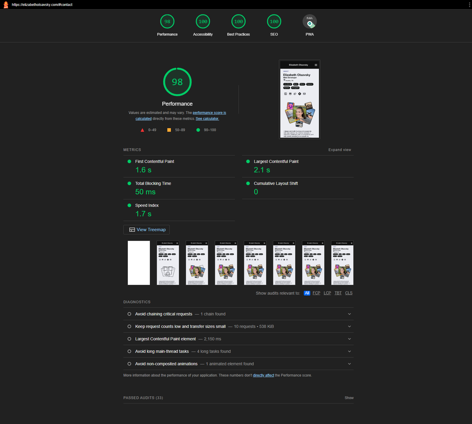
Results
By implementing these simple fixes with the resources mentioned above, I was able to increase my performance significantly. Check out my latest report!
It's important to note that it is not uncommon to see fluctuations in Lighthouse scores, even without making changes to the website. Fluctuations can be caused by network conditions, browser updates, caching, server location, and lots of other factors. It's important to use the scores as a guide for identifying areas of improvement rather than focusing solely on the score. Regular monitoring and identifying trends can provide a more accurate reflection of your website's performance.
I learned a lot by analyzing my Lighthouse scores and using the feedback provided in the report. I already have some thoughts on how I can apply what I've learned when I begin my next web project.